

Colors play a vital role in our everyday lives. In fact, it can influence our emotions, decisions, and perceptions. For example, the color blue depicts a calming effect of a clear sky. Then, red presents a vibrant energy which is perfect for advertisements. Lastly, green often conveys trustworthiness and go signals. So colors have the power to shape how we feel and react. In this post, let’s discover the world of colors. We will also explore a wide range of shades, their meanings, and how they can be effectively used in design.
Discovering all the Colors in the World
- Understanding Colors and Their Impact
- Popular Shades of Red and Their Hex Codes
- Popular Shades of Blue and Their Hex Codes
- Popular Shades of Green and Their Hex Codes
Understanding Colors and Their Impact
The Psychology of Colors
Colors have a profound psychological impact on how we perceive the world around us. Each color carries its own set of emotions that can influence our moods. For example, red is often associated with energy, passion, and urgency, making it a popular choice for call-to-action buttons and sales promotions. Meanwhile, Blue is linked to calmness, trust, and stability. That’s why it’s used in corporate branding and financial institutions. Warm colors like red, orange, and yellow create feelings of warmth and comfort. Additionally, cool colors like blue, green, and purple tend to have a calming effect.
In design, understanding the psychology of colors is important. Designers in various industries, including photo editing, use color to steer audience behaviors. For instance, the hospitality industry often uses warm, inviting colors to make guests feel welcome. Meanwhile healthcare environments choose cooler hues to promote calmness and healing.
The Role of Colors in Branding
Colors are more than just aesthetic choices; they are key elements of a brand’s identity. The colors a brand chooses can communicate its values, personality, and even its market positioning. For example, a brand targeting a youthful, energetic demographic might go for vibrant colors like neon green or hot pink. On the other hand, a luxury brand might lean towards rich tones like royal purple or black.
Brand colors are often the first thing people notice, and they leave a lasting impression. This is why consistency in color use across all branding materials is vital. When used effectively, colors can help a brand stand out in a crowded market and build emotional connections with consumers.
Consider iconic brands like Coca-Cola and its signature red, or Tiffany & Co. and its distinctive robin’s egg blue. These colors are so ingrained in the brand’s identity that they are instantly recognizable. This level of recognition is a testament to the power of color in branding.
Popular Shades of Red and Their Hex Codes
These popular shades of red offer a wide range of options for designers to evoke specific emotions and set the tone in their projects. Whether you’re aiming for boldness, elegance, or warmth, there’s a shade of red to suit your needs.
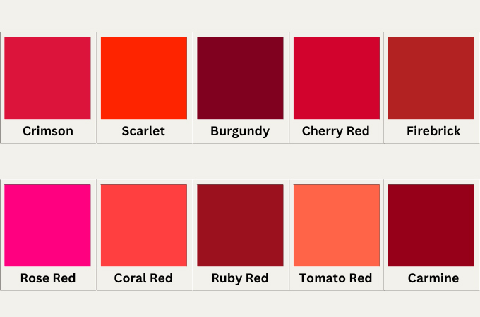
1. Crimson (#DC143C): Crimson is a deep, vivid shade of red that is often associated with passion, love, and intensity. Its slightly darker tone makes it a popular choice for creating a dramatic and bold effect in designs.
2. Scarlet (#FF2400): Scarlet is a bright, vibrant red with a hint of orange, evoking feelings of energy and excitement. It’s frequently used in designs that aim to grab attention and convey urgency, such as sale promotions and warning labels.
3. Burgundy (#800020): Burgundy is a dark, rich shade of red with purplish undertones, symbolizing sophistication and luxury. This color is commonly used in high-end branding, fashion, and interior design to create an elegant and refined look.
4. Cherry Red (#D2042D): Cherry Red is a bright, cheerful shade that resembles the color of ripe cherries. It exudes warmth and enthusiasm, making it a popular choice for playful and fun designs, especially in branding and advertising.
5. Firebrick (#B22222): Firebrick is a darker, more muted red with a slightly brownish tone. It’s often used in designs that require a strong, earthy red, such as in rustic themes or to evoke a sense of durability and reliability.
6. Rose Red (#FF007F): Rose Red is a bright, pinkish-red shade that combines the passion of red with the softness of pink. It’s often associated with romance, love, and femininity, making it a popular choice for designs related to Valentine’s Day or romantic themes.
7. Coral Red (#FF4040): Coral Red is a lively, warm red with a hint of orange, reminiscent of coral reefs. It’s used to convey energy, vibrancy, and a tropical feel, making it a great choice for summer-themed designs and beach-related branding.
8. Ruby Red (#9B111E): Ruby Red is a deep, jewel-toned red that embodies luxury and elegance. It’s a favorite in fashion and jewelry designs, symbolizing wealth, passion, and desire.
9. Tomato Red (#FF6347): Tomato Red is a bright, orange-tinged red that resembles the color of ripe tomatoes. It’s fresh and inviting, often used in food branding and packaging to stimulate appetite and create a sense of warmth.
10 Carmine (#960018): Carmine is a rich, dark red with a slightly purplish hue. It’s a classic color associated with royalty and prestige, frequently used in traditional and formal designs to convey a sense of importance and gravitas.
Popular Shades of Blue and Their Hex Codes
These shades of blue each bring their own unique qualities to the table. They offer designers a versatile palette to evoke everything from calmness and professionalism to vibrancy and creativity.
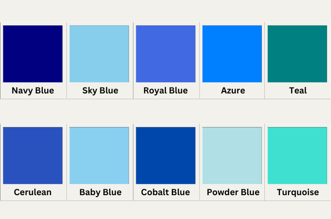
1. Navy Blue (#000080): Navy Blue is a deep, dark shade of blue that exudes sophistication and authority. It’s often used in formal settings, such as corporate branding, uniforms, and interior design, to convey a sense of professionalism and reliability.
2. Sky Blue (#87CEEB): Sky Blue is a light, airy shade that resembles the clear daytime sky. It evokes feelings of calmness, freedom, and tranquility, making it a popular choice for designs related to nature, relaxation, and wellness.
3. Royal Blue (#4169E1): Royal Blue is a bright, vivid blue that carries a sense of grandeur and elegance. Historically associated with royalty and luxury, it’s often used in branding to create a prestigious and striking visual impact.
4. Azure (#007FFF): Azure is a bright, sky-like blue that sits between cyan and blue on the color spectrum. It’s fresh and energetic, often used in designs that aim to convey openness, optimism, and clarity, such as tech and communication brands.
5. Teal (#008080): Teal is a medium-dark blend of blue and green that is both calming and invigorating. It’s commonly used in designs that seek to balance professionalism with creativity, making it popular in healthcare, finance, and wellness industries.
6. Cerulean (#2A52BE): Cerulean is a deep, rich blue that resembles the color of the ocean at midday. It conveys a sense of depth, stability, and serenity, often used in designs related to travel, adventure, and the environment.
7. Baby Blue (#89CFF0): Baby Blue is a soft, pale shade of blue that is often associated with innocence, youth, and serenity. It’s frequently used in designs for children’s products, baby showers, and to evoke a gentle, calming atmosphere.
8. Cobalt Blue (#0047AB): Cobalt Blue is a striking, intense blue that commands attention. It’s often used in bold, modern designs, as well as in art and fashion, to create a strong, vibrant visual statement.
9. Powder Blue (#B0E0E6): Powder Blue is a soft, muted blue that offers a delicate and soothing appearance. It’s often used in interior design, fashion, and branding to create a peaceful and elegant ambiance.
10. Turquoise (#40E0D0): Turquoise is a bright, vibrant blend of blue and green that evokes tropical vibes and creativity. It’s frequently used in designs that want to capture a sense of fun, adventure, and freshness, making it popular in beachwear, jewelry, and travel branding.
Popular Shades of Green and Their Hex Codes
These shades of green offer a wide spectrum of emotions and meanings, from the vibrant and energetic to the calm and sophisticated. Whether you’re looking to convey a sense of natural beauty, luxury, or freshness, there’s a shade of green to suit your design needs.
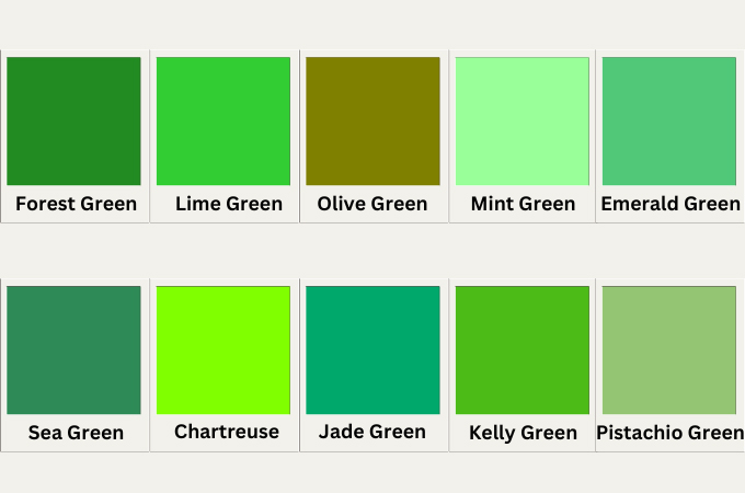
1. Forest Green (#228B22): Forest Green is a deep, rich shade of green that resembles the dense foliage of a forest. It’s associated with nature, growth, and stability, often used in designs that aim to evoke a sense of natural beauty and environmental awareness.
2. Lime Green (#32CD32): Lime Green is a bright, vibrant green with yellow undertones, reminiscent of the color of fresh limes. It’s lively and energetic, frequently used in designs that want to convey freshness, youth, and vitality, especially in food and beverage branding.
3. Olive Green (#808000): Olive Green is a muted, earthy shade that has a yellowish tint. It’s often associated with peace, wisdom, and tradition, making it a popular choice in military, outdoor, and heritage designs.
4. Mint Green (#98FF98): Mint Green is a soft, pastel green that has a refreshing and calming effect. It’s commonly used in designs related to health, wellness, and beauty, as it evokes cleanliness and tranquility.
5. Emerald Green (#50C878): Emerald Green is a bright, luxurious shade that resembles the precious gemstone. It symbolizes wealth, elegance, and renewal, often used in high-end branding, fashion, and interior design to create a sense of opulence and vibrancy.
6. Sea Green (#2E8B57): Sea Green is a medium to dark green with blue undertones, similar to the color of the sea in certain lighting. It’s calming and refreshing, making it a great choice for designs related to water, relaxation, and nature.
7. Chartreuse (#7FFF00): Chartreuse is a vivid, yellow-green shade that stands out for its brightness and energy. It’s often used in bold, modern designs to grab attention, especially in advertising and fashion.
8. Jade Green (#00A86B): Jade Green is a medium, slightly muted green that resembles the color of the jade stone. It’s associated with harmony, balance, and prosperity, making it a popular choice in designs related to wellness, luxury, and cultural heritage.
9. Kelly Green (#4CBB17): Kelly Green is a bright, pure green that is commonly associated with luck, especially in Irish culture. It’s a lively and cheerful shade, often used in sports, branding, and festive designs to evoke a sense of energy and positivity.
10. Pistachio Green (#93C572): Pistachio Green is a soft, muted green with a slight yellow undertone, similar to the color of pistachio nuts. It’s calming and earthy, often used in designs that seek to convey subtlety, comfort, and a connection to nature.
Conclusion
Colors are more than just visual elements. They hold deep meanings and have the power to influence emotions, decisions, and brand perceptions. This guide has explored the rich world of colors, providing both their meanings and hex codes. Whether you’re a designer, marketer, or simply a color enthusiast, understanding these aspects will help you make informed decisions that resonate with your audience and enhance your projects.
Leave a Comment